|
|
Post by Char-Vell on Nov 6, 2018 7:32:27 GMT -5
I love it!
thanks!
|
|
|
|
Post by kemp on Nov 6, 2018 8:13:13 GMT -5
Conan vs the Undead Monster of Gabrelle Pok (SSOC 79).Great stuff from Buscema and Chan. 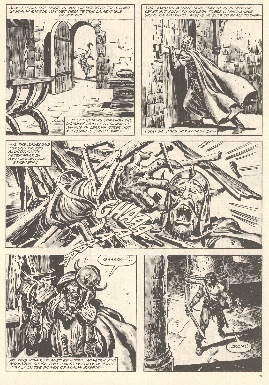 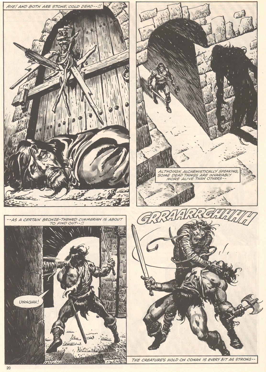 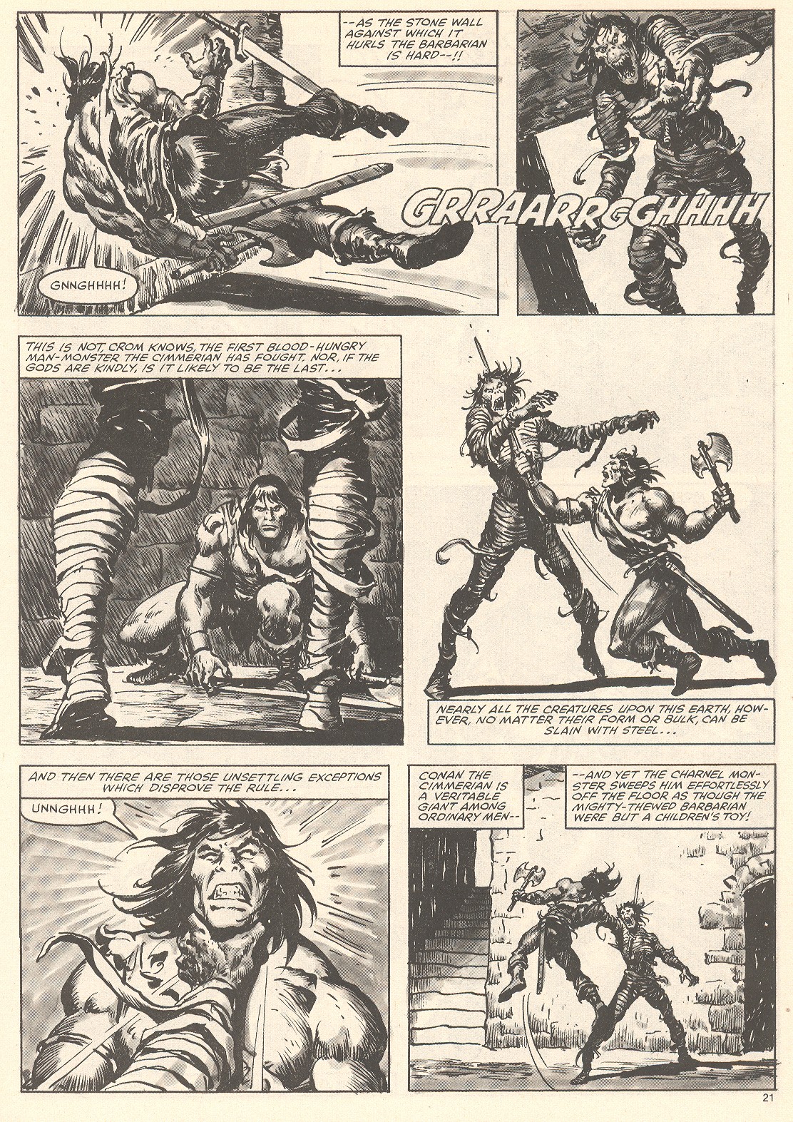 Hard to beat a Buscema and Chan collaboration. This stuff is some of the best comic illustration art in the history of the medium. I mean, just look at those panels, action, horror, suspense and just cool heroic fantasy art that more than compliments the narrative structure. The guys bringing SSOC back next year better be taking notes. |
|
|
|
Post by emerald on Nov 10, 2018 23:40:17 GMT -5
Conan vs the Undead Monster of Gabrelle Pok (SSOC 79).Great stuff from Buscema and Chan. Hard to beat a Buscema and Chan collaboration. This stuff is some of the best comic illustration art in the history of the medium. I mean, just look at those panels, action, horror, suspense and just cool heroic fantasy art that more than compliments the narrative structure. The guys bringing SSOC back next year better be taking notes. And again I'm forced to realize just how profoundly I took Big John's art for granted back in the day.
Am I wrong, or is this kind of cinematically choreographed combat basically unseen in modern comics?
Just look at how the action flows, and how much sheer impact Buscema can put into a panel. You can see exactly how the zombie seizes Conan, and feel the brutal impact as he is hurled against a pillar. And his rising from the floor becomes an upward thrust of his sword...
Really great stuff. Many thanks for posting, Hun.
|
|
|
|
Post by kemp on Nov 11, 2018 9:56:34 GMT -5
Hard to beat a Buscema and Chan collaboration. This stuff is some of the best comic illustration art in the history of the medium. I mean, just look at those panels, action, horror, suspense and just cool heroic fantasy art that more than compliments the narrative structure. The guys bringing SSOC back next year better be taking notes. And again I'm forced to realize just how profoundly I took Big John's art for granted back in the day.
Am I wrong, or is this kind of cinematically choreographed combat basically unseen in modern comics?
Just look at how the action flows, and how much sheer impact Buscema can put into a panel. You can see exactly how the zombie seizes Conan, and feel the brutal impact as he is hurled against a pillar. And his rising from the floor becomes an upward thrust of his sword...
Really great stuff. Many thanks for posting, Hun.
No, I don't think you are wrong, I hold a similar position, and I don't think my view is influenced by a certain type of nostalgia ( well, maybe a little ). I am also of the opinion that the black and white pencils and ink format further ads to the impact of the panels when talents like Buscema and Chan are doing the interior art. That zombie really disturbed me years ago, and that is the effect I liked on me when I read SSOC. I was disappointed to learn that the new SSOC will be in colour and comic sized. I always felt that the larger magazine format meant that we got to read and collect something really special, something not controlled by the normal rules that applied to strips called comics. |
|
Deleted
Deleted Member
Posts: 0
|
Post by Deleted on Nov 12, 2018 2:14:40 GMT -5
Yeah, Buscema made it look easy.
|
|
|
|
Post by kemp on Nov 15, 2018 8:22:14 GMT -5
Buscema also worked well with Alfredo Alcala and Rudy Nebres. Look at the action, like you can almost feel those violent blows, the force of the morning star weapon against shield. I can't believe that I took this stuff for granted back than, so much talent back in the twentieth. Talent backed up with dedication, practise and skill.  |
|
|
|
Post by kemp on Nov 16, 2018 10:50:42 GMT -5
No, I don't think you are wrong, I hold a similar position, and I don't think my view is influenced by a certain type of nostalgia ( well, maybe a little ). I am also of the opinion that the black and white pencils and ink format further ads to the impact of the panels when talents like Buscema and Chan are doing the interior art. That zombie really disturbed me years ago, and that is the effect I liked on me when I read SSOC. I was disappointed to learn that the new SSOC will be in colour and comic sized. I always felt that the larger magazine format meant that we got to read and collect something really special, something not controlled by the normal rules that applied to strips called comics. Looking at those examples above in the context of what’s being produced nowadays in comics, as well as with the passage of many years, I can see a lot of the qualities that made Big John my favourite of the Marvel artists - the power of his figures and his storytelling ability, for instance. Of all the great Marvel artists during the time I was seriously buying comics - say from the late sixties to the early eighties - Big John was undoubtedly my favourite, and I went out of my way to buy anything of his that I could find. In the early part of that time - up to the mid-seventies - there was a big progression in his art, from his slightly clunkier early Avengers issues up to his powerhouse years on CtB and Savage sword. He was lucky to have some very capable inkers who, even though they had very strong styles of their own, didn’t detract from JB’s strengths - Palmer and Sinnott being obvious examples, as well as Ernie Chan in his Ernie Chua days on Conan. However, the fact is that these examples were released at a time when I had been buying JB’s comics for about twenty years, and his work was starting to feel slightly repetitive and boring in comparison to the work he produced in the earlier days. It felt as if I had seen it all before, only now his art was in the service of inferior stories, and, in my opinion, was being overpowered by the inking work of artists like Chan and the others mentioned above. I liked Ernie Chan/Chua’s work on the early JB colour Conan because it still felt very much like JB was the dominant partner in their collaboration, but when EC returned after his hiatus that dominance seemed to be reversed. Maybe JB didn’t have as much time to spend on his pencils, and his inkers were being asked to contribute more, but whatever the reason I didn’t like it as much, both in colour and B&W. The best example is Savage Sword of Conan. The Buscema/Alcala art on the early issues was so good that the drop-off in quality even in the space of a few years was very noticeable, although, to be fair, the printing on some of the issues was poor. Tony DeZuniga was another whose inks could be excellent but would often overwhelm even JB’s pencils. I suppose the ideal solution would have been for JB to ink himself, but, of course, he just didn’t have the time to do that. As I say, looking at some of the examples posted here makes me appreciate them more now than I did at the time. ......  Some collaborations worked better than others, and sometimes I just wanted John Buscema to do the all of the art, pencils and inks. It varied, other times I just enjoyed the art of Gil Kane. Ernie Chan's inks were enhanced by JB's breakdowns. At least I always preferred the way it looked compared to Ernie doing all of the art work for any one project/story. John Buscema was undoubtedly influenced by artists such as Frank Frazetta early in his career, but the thing was that I first became aware of comic artists like JB, and only later learnt about Frazetta, even though I saw his work here and there. Yeah, I took the art for granted back in the 80's, but looking back now it amazes me the level of talent in the twentieth century in all sorts of stuff. I kind of compare it to watching Michael Jackson on screen now and thinking, 'man, he really was an amazing performer'. |
|
|
|
Post by deuce on Nov 28, 2018 12:56:07 GMT -5
Whoa! Check out this PDF of an article from Ares magazine: www.digital-eel.com/files/Conan_-_A_Synopsis_-_Ares_Special_1.pdfI'd never seen that Truman illo of Conan before. I have to say that it's easily one of the best renditions from Tim that I've ever laid eyes on. Just badass. If anyone with more cyber-smarts than myself can pull it off, feel free to somehow extricate the pic and post it here.  |
|
Deleted
Deleted Member
Posts: 0
|
Post by Deleted on Nov 28, 2018 13:04:31 GMT -5
|
|
|
|
Post by deuce on Nov 29, 2018 11:50:59 GMT -5
Much obliged, Hun! I should've tried that search myself.
|
|
Deleted
Deleted Member
Posts: 0
|
Post by Deleted on Jan 6, 2019 18:48:31 GMT -5
Rode Spijkers (Red Nails) Barry Windsor-Smith cover for Dutch translation Published by Sherpa Publishing in 2007 (Cover illustration originally from BWS' portfolio by Gorblimey Press, 1974). 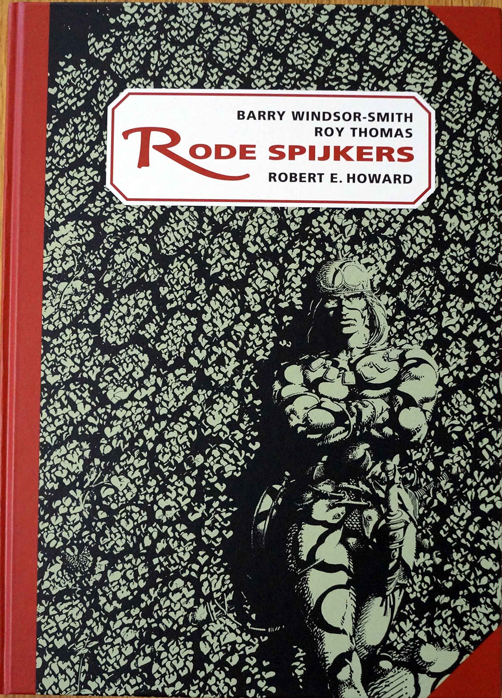 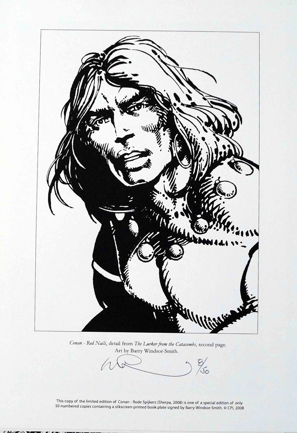 |
|
Deleted
Deleted Member
Posts: 0
|
Post by Deleted on Jan 6, 2019 18:51:55 GMT -5
Double-page spread from the Dutch translation of Red Nails: 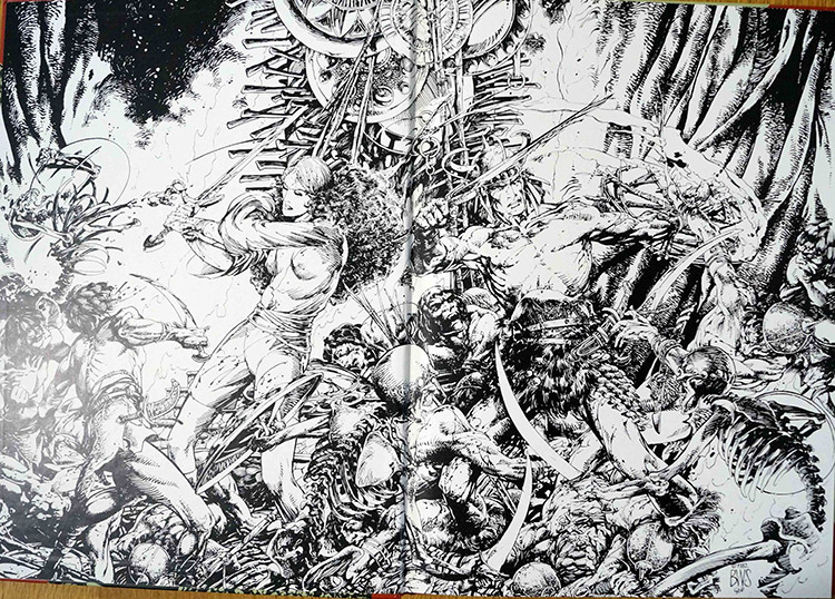 |
|
Deleted
Deleted Member
Posts: 0
|
Post by Deleted on Mar 21, 2019 12:07:34 GMT -5
 A nice piece by Neal Adams. |
|
|
|
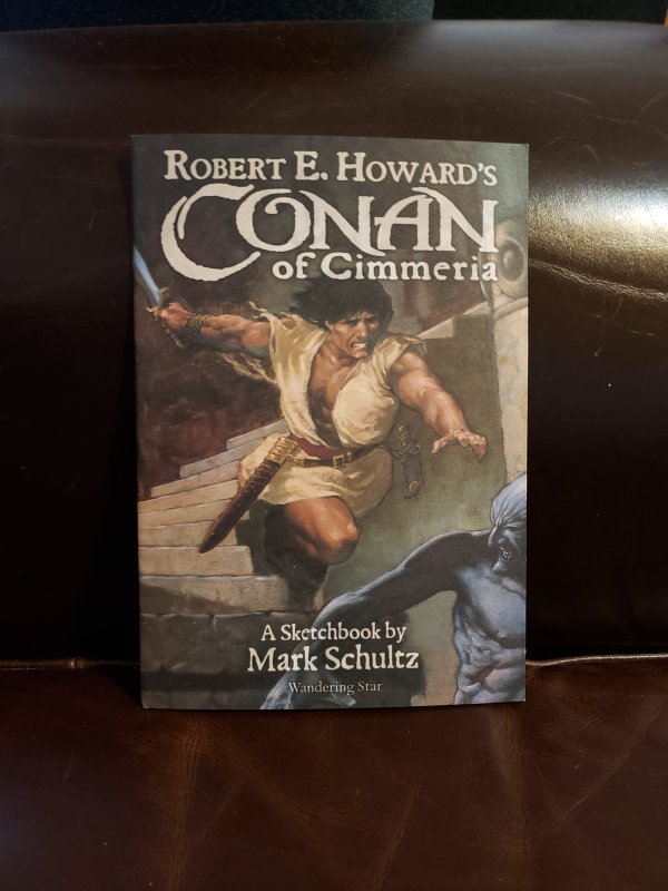
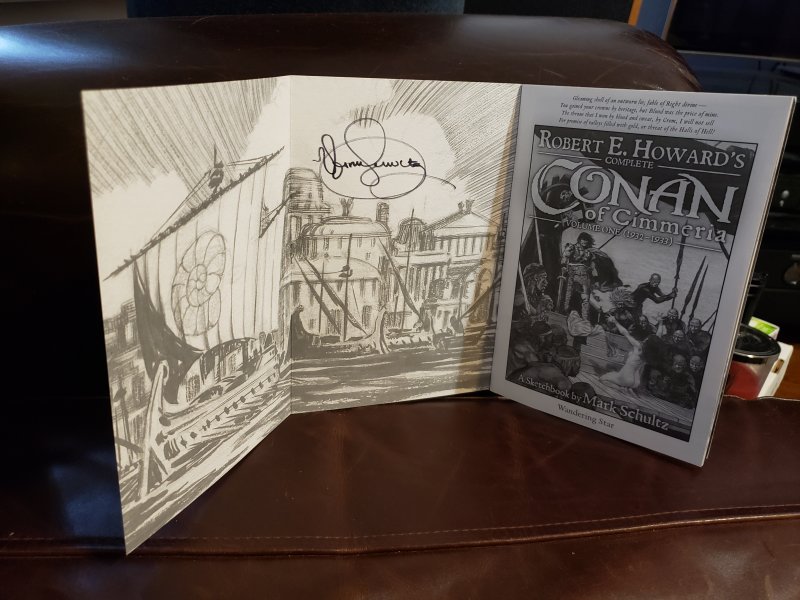
Post by charleshelm on Mar 30, 2019 17:04:45 GMT -5
I picked a signed copy of this up off the 'Bay recently....what will my kids do with this stuff when I am gone?
|
|
|
|
Post by Taurus on Mar 30, 2019 19:06:48 GMT -5
Looks nice.
|
|