|
|
Post by johnnypt on Feb 11, 2023 19:45:55 GMT -5
Turns out we have a comic shop right near us, may have to swing by on FCBD to pick one up and see if they'll carry the title regularly.
|
|
|
|
Post by boboldman on Feb 11, 2023 19:58:39 GMT -5
That Conan FCBD cover says "302" - I assume that is continuing the legacy numbering from the Marvel series which at ended at "300". Where is #301?
|
|
|
|
Post by Jason Aiken on Feb 11, 2023 21:09:21 GMT -5
That Conan FCBD cover says "302" - I assume that is continuing the legacy numbering from the Marvel series which at ended at "300". Where is #301? Conan King Size came out before Conan #300, right? That would be my best guess, but that might have already been factored into #300. |
|
|
|
Post by Taurus on Feb 11, 2023 21:58:05 GMT -5
Dan Panosian working on a new Conan title? Very good. I like it. It looks promising. |
|
Deleted
Deleted Member
Posts: 0
|
Post by Deleted on Feb 12, 2023 7:54:29 GMT -5
I just hope we're not disappointed in the storytelling. The art by Torre and Panosian looks incredibly promising.
|
|
|
|
Post by drsolarmota on Feb 12, 2023 8:45:56 GMT -5
Here's the cover for the Free Comic Book Day issue: 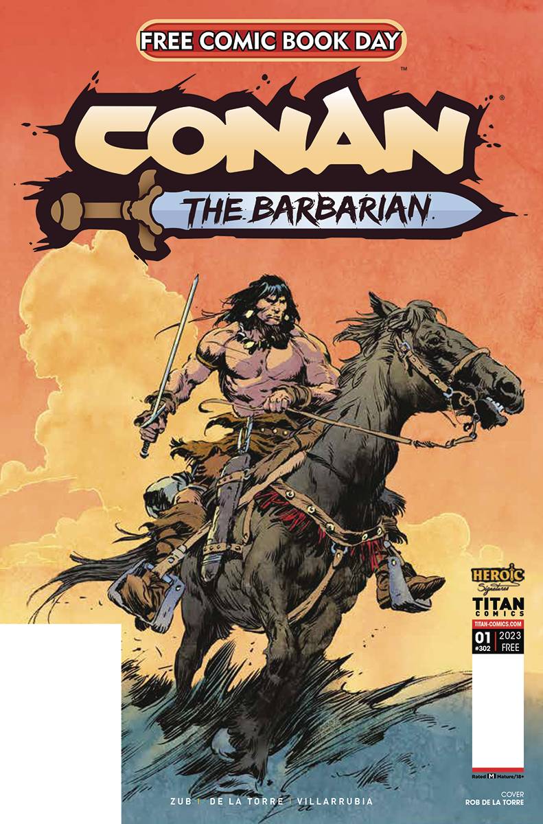 I hope that's not the final logo. To have such beautiful cover art destroyed by a cartoon looking sword... |
|
|
|
Post by boot on Feb 12, 2023 10:33:30 GMT -5
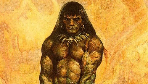
Isn't that the image (it was B&W) that was printed in the new S.M. Sterling novel?
|
|
Deleted
Deleted Member
Posts: 0
|
Post by Deleted on Feb 13, 2023 12:58:42 GMT -5
Here's the cover for the Free Comic Book Day issue: I hope that's not the final logo. To have such beautiful cover art destroyed by a cartoon looking sword... Yeah, gotta agree, the logo looks even worse than the recent Marvel rendition. |
|
|
|
Post by Taurus on Feb 13, 2023 15:58:49 GMT -5
That logo really fits a Groo comic.
|
|
Deleted
Deleted Member
Posts: 0
|
Post by Deleted on Feb 13, 2023 22:20:02 GMT -5
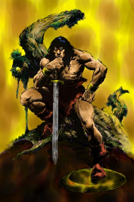
Kinda looks like the one for Heroic Signatures:  |
|
|
|
Post by Monster on Feb 14, 2023 21:23:16 GMT -5
I am really optimistic for this, loving the art and the prospects for the writing. But, as others have pointed out, NOT digging the logo! I am glad others think so, and have brought it up, and not sure why they cannot get it right. The Marvel logo looked like a rough draft that was never finalized. This, the 'Conan' font looks like it is Ultra Ultra Bold. Really odd. And my first impression was that that looks like a toy sword. A Fisher-Price "My First Conan Sword™." Ages 4 and up!
|
|
|
|
Post by Von K on Feb 14, 2023 22:08:51 GMT -5
This is important promotional material and first impressions count. Imho,they should ask Rob de la Torre to do the logo.
|
|
|
|
Post by Taurus on Feb 15, 2023 14:58:52 GMT -5
|
|
|
|
Post by Jason Aiken on Feb 15, 2023 17:21:25 GMT -5
The logo(s) aren't horrible imho. If the interior art and stories are good, I'll be happy.
|
|
|
|
Post by danieljames495 on Feb 15, 2023 23:40:48 GMT -5
I used to live in Guyana which is just north of Brazil and one of the first Savage Sword comics I read was an edition from Brazil. Absolutely loved the font, just seeing it brings back a ton of nostalgia. |
|