|
|
Post by Monster on Jan 23, 2020 3:44:20 GMT -5
Treated? Err. . . tortured?
|
|
Deleted
Deleted Member
Posts: 0
|
Post by Deleted on Jan 24, 2020 11:48:24 GMT -5
 CONAN THE BARBARIAN #15 CONAN THE BARBARIAN #15JIM ZUB (W) • ROGÊ ANTÔNIO (A) • Cover by E.M. GIST Variant Cover by SKAN MURDER IN THE PITS OF THE CRUCIBLE!
• CONAN’s fate is altered by the sudden murder of one of the contestants!
• But as all signs point to Conan’s guilt, has he fallen victim to a cruel betrayal…or a demonic possession clouding his actions?
• The Crucible tournament continues with its deadliest twist yet!
32 PGS./Parental Advisory …$3.99 Release Date:22 April 2020 |
|
|
|
Post by stubbs on Jan 25, 2020 5:03:50 GMT -5
|
|
Deleted
Deleted Member
Posts: 0
|
Post by Deleted on Jan 28, 2020 10:42:45 GMT -5
|
|
|
|
Post by Taurus on Jan 28, 2020 11:10:19 GMT -5
I know I am mostly complaining, but I can't help: the art is so average. Where are the big names?
|
|
Deleted
Deleted Member
Posts: 0
|
Post by Deleted on Jan 28, 2020 11:18:52 GMT -5
I know I am mostly complaining, but I can't help: the art is so average. Where are the big names? Yeah, they shoulda got a big name on at least one of the books by now. Most of the big artists do cover work these days. |
|
Deleted
Deleted Member
Posts: 0
|
Post by Deleted on Feb 12, 2020 2:41:40 GMT -5
I don't know if I like these covers. The end result is kinda awkward looking, I think Gist has a problem with Conan's upper body, especially the head and shoulders (not the shampoo  ). The problem is further demonstrated in Gist's cover for CtB 13:  |
|
|
|
Post by kemp on Feb 12, 2020 7:00:19 GMT -5
 CONAN THE BARBARIAN #15 CONAN THE BARBARIAN #15JIM ZUB (W) • ROGÊ ANTÔNIO (A) • Cover by E.M. GIST Variant Cover by SKAN MURDER IN THE PITS OF THE CRUCIBLE!
• CONAN’s fate is altered by the sudden murder of one of the contestants!
• But as all signs point to Conan’s guilt, has he fallen victim to a cruel betrayal…or a demonic possession clouding his actions?
• The Crucible tournament continues with its deadliest twist yet!
32 PGS./Parental Advisory …$3.99 Release Date:22 April 2020 Really dig the cover art, that would not look out of place on one of the classic SSOC. The head and shoulders seem right on this one at least. The crucible tournament comes across D & D, or fantasy gamebook. I like that, hope when I get to the story it's not a let down. |
|
Deleted
Deleted Member
Posts: 0
|
Post by Deleted on Feb 12, 2020 17:16:20 GMT -5
CONAN THE BARBARIAN #15JIM ZUB (W) • ROGÊ ANTÔNIO (A) • Cover by E.M. GIST Variant Cover by SKAN MURDER IN THE PITS OF THE CRUCIBLE!
• CONAN’s fate is altered by the sudden murder of one of the contestants!
• But as all signs point to Conan’s guilt, has he fallen victim to a cruel betrayal…or a demonic possession clouding his actions?
• The Crucible tournament continues with its deadliest twist yet!
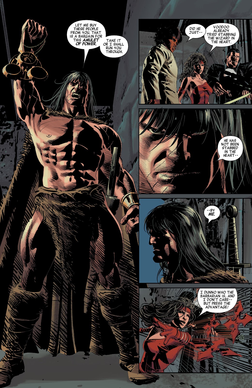
32 PGS./Parental Advisory …$3.99 Release Date:22 April 2020 Really dig the cover art, that would not look out of place on one of the classic SSOC. The head and shoulders seem right on this one at least. The crucible tournament comes across D & D, or fantasy gamebook. I like that, hope when I get to the story it's not a let down. Yeah, I think the cover for 15 is better than the one for issue 13. I have noticed it is common when some artists use digital software for the layout of a character. If the character's face needs realignment, it is selected and moved to where it should be and it becomes real difficult when attempting to realign the shoulders convincingly. You can also see it in Deodato's work on the Savage Avengers.  The way Conan has raised his right arm is almost like an action figure, nothing has changed on that side of Conan's torso. It looks like Deodato used some kinda 3d software on SA. Even Brother Voodoo's jacket don't look right, it looks back to front. The thing is Deodato can draw. On the business side of things, I guess it is quicker for an artist with a digital tablet, you can paid for the inking as well. |
|
|
|
Post by wolfshead on Feb 12, 2020 19:44:47 GMT -5
What I really liked about John Buscema's work was that his drawings were always in perfect proportion, never awkwardly twisted and his musculature, was always powerful, was never been possibility. He understood anatomy and one never had to suspend disbelief to appreciate his drawings. In that sense, he made the world of Conan a real one and never made his art distract from the story. This allowed a reader to become fully immersed in the Hyborian age and never have to sayu "WTF."
|
|
|
|
Post by Taurus on Feb 12, 2020 22:17:46 GMT -5
Jesus, this art is so amateurish.
Seriously, the whole series is a huge waste of time and money. This thing is made only to grab some cash, there is no love into it or any sense of purpose. Marvel is destroying the good things Conan has always brought to the table and is working only on building a ridiculous barbarian with no brain, like a Hulk, but only worse.
And what amuses me just the same is that you guys keep giving it attention. It does not deserve any credit at all (ok, the cover is nice, but a good comic is not made only by a cover).
Marvel is always thinking about ways to reach new lows and the fact is that they have been very good in doing it.
The only good thing about Conan now are the paperback trades. They are awesome but rely on a work that is done already and that does not translate in what the company is about today.
I only bothered buying the first two Conan the Barbarian numbers and after reading those two (and the story built around those picts and those gigantic snakes, what a waste of a story) I kept reading the series on "read comics on line" because there is no way I am spending a cent in acquiring such garbage comics.
|
|
|
|
Post by bonesaw on Feb 13, 2020 7:22:24 GMT -5
I won't go anywhere near any of this new stuff. So much of it looks and reads like such garbage. I am completely content saving my money for the omnibuses coming out and even backtracking to pick up stuff like Chronicles of King Conan. I agree with taurus too. I mean at what point do you just stop acknowledging this stuff as anything worth interest?
|
|
Deleted
Deleted Member
Posts: 0
|
Post by Deleted on Feb 14, 2020 0:14:40 GMT -5
|
|
Deleted
Deleted Member
Posts: 0
|
Post by Deleted on Feb 14, 2020 0:38:16 GMT -5
What I really liked about John Buscema's work was that his drawings were always in perfect proportion, never awkwardly twisted and his musculature, was always powerful, was never been possibility. He understood anatomy and one never had to suspend disbelief to appreciate his drawings. In that sense, he made the world of Conan a real one and never made his art distract from the story. This allowed a reader to become fully immersed in the Hyborian age and never have to sayu "WTF." Yeah, by Crom and Tengri, Buscema was and still is the greatest. |
|
|
|
Post by kemp on Feb 14, 2020 4:15:22 GMT -5
Really dig the cover art, that would not look out of place on one of the classic SSOC. The head and shoulders seem right on this one at least. The crucible tournament comes across D & D, or fantasy gamebook. I like that, hope when I get to the story it's not a let down. Yeah, I think the cover for 15 is better than the one for issue 13. I have noticed it is common when some artists use digital software for the layout of a character. If the character's face needs realignment, it is selected and moved to where it should be and it becomes real difficult when attempting to realign the shoulders convincingly. You can also see it in Deodato's work on the Savage Avengers.  The way Conan has raised his right arm is almost like an action figure, nothing has changed on that side of Conan's torso. It looks like Deodato used some kinda 3d software on SA. Even Brother Voodoo's jacket don't look right, it looks back to front. The thing is Deodato can draw. On the business side of things, I guess it is quicker for an artist with a digital tablet, you can paid for the inking as well. I concur with some of the other comments to a certain degree, and Conan does look wooden in that panel. There are some instances where the artwork looks disjointed, awkward proportions, notably the interior work. Not knocking digital art software myself, some of it is fantastic when done right ( that cover for 15 ), a great media, but I miss the seamless quality of the pencil and ink on paper work by artists such as John Buscema, Alfredo Alcala, Gary Kwapisz and Ernie Chan that didn’t have to resort to bad copy and paste techniques to get the art done by the set deadlines. |
|