|
|
Post by johnnypt on Apr 10, 2019 15:46:16 GMT -5
That guy needs a No-Prize for sure. He deserves it! Mark's response almost sounds like an old Johnny Carson routine: "Wild wacky stuff..." |
|
|
|
Post by Ascane on Apr 10, 2019 15:50:41 GMT -5
|
|
|
|
Post by johnnypt on Apr 10, 2019 16:04:18 GMT -5
|
|
Deleted
Deleted Member
Posts: 0
|
Post by Deleted on Apr 10, 2019 16:09:22 GMT -5
Don't look bad in black & white but, unfortunately it still looks too digital.
|
|
|
|
Post by johnnypt on Apr 10, 2019 16:15:57 GMT -5
Don't look bad in black & white but, unfortunately it still looks too digital. Sadly, it's the world we're in now.  |
|
Deleted
Deleted Member
Posts: 0
|
Post by Deleted on Apr 10, 2019 16:23:38 GMT -5
Don't look bad in black & white but, unfortunately it still looks too digital. Sadly, it's the world we're in now. Yeah, I guess it is. It'd be interesting to see what it would have looked like without the colors of Richard Isanove. I think Isanove also added a great deal of detail over Ron Garney's line-work. |
|
|
|
Post by wulfhere on Apr 10, 2019 17:36:24 GMT -5
 King Conan by Ron Garney. That axe is ridiculous |
|
|
|
Post by mindboggled on Apr 10, 2019 23:25:21 GMT -5
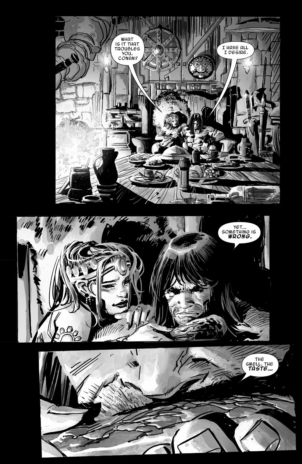
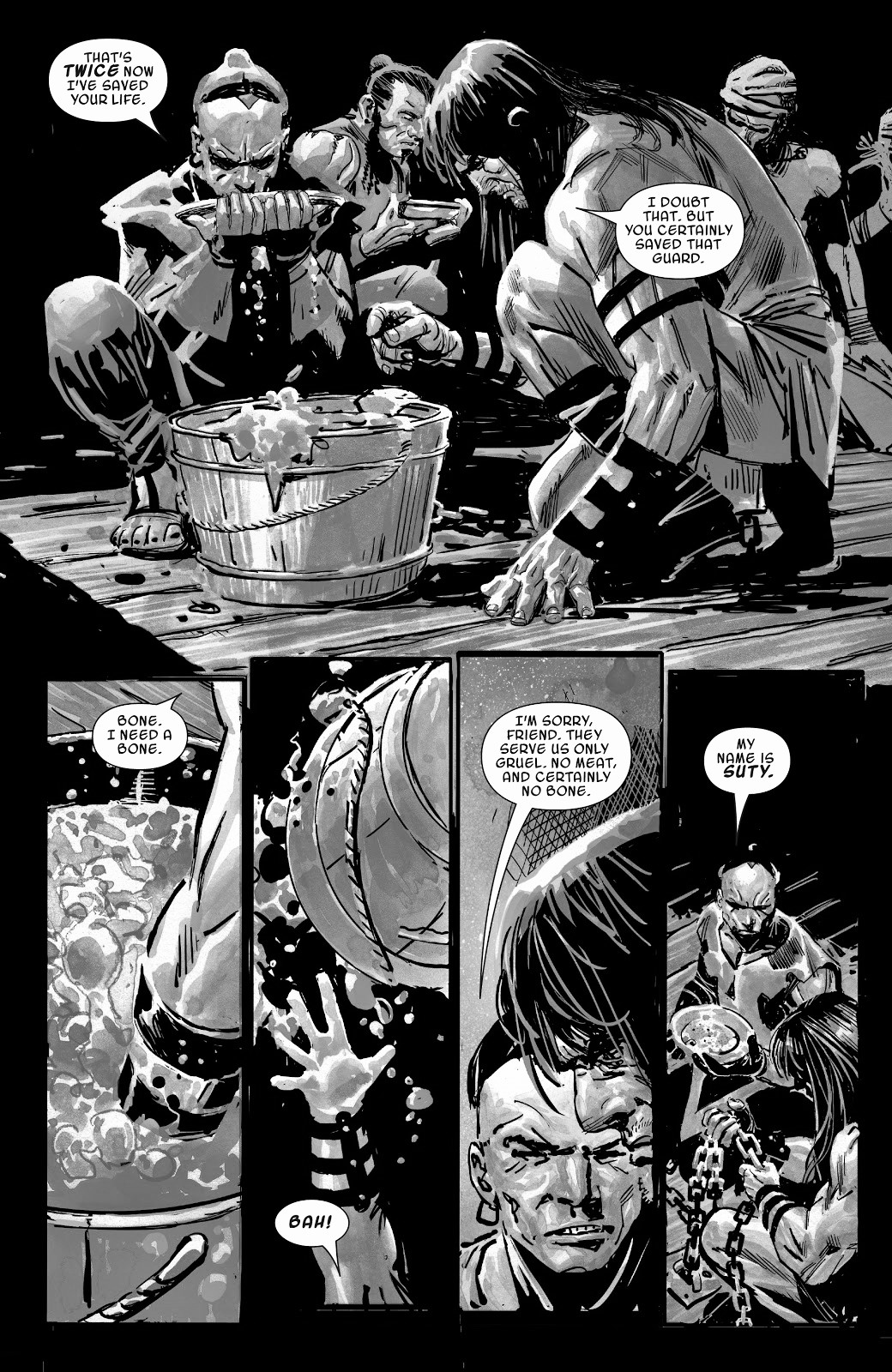
This issue was fun, a light read. It was strange seeing Conan get so upset set over Suty's death. They only spent a couple of days together, and Suty did not seem all that likable.
|
|
|
|
Post by mindboggled on Apr 10, 2019 23:53:56 GMT -5
Garney's art looks 100% better in Black and White... I disagree, Richard Isanove is picking up Ron Garney's slack. Some of his panels do look good, specifically the larger ones, but generally they look poor. |
|
|
|
Post by Taurus on Apr 11, 2019 7:03:50 GMT -5
Garney's art looks 100% better in Black and White... I disagree, Richard Isanove is picking up Ron Garney's slack. Some of his panels do look good, specifically the larger ones, but generally they look poor. Richard Isanove is a poor colorist. His work on Dark Horse's Rogues in the House left to be desired and could not be compared to the fantastic job Dave Stewart had been doing at the time with the Conan comic. |
|
|
|
Post by johnnypt on Apr 11, 2019 7:12:58 GMT -5
I disagree, Richard Isanove is picking up Ron Garney's slack. Some of his panels do look good, specifically the larger ones, but generally they look poor. Richard Isanove is a poor colorist. His work on Dark Horse's Rogues in the House left to be desired and could not be compared to the fantastic job Dave Stewart had been doing at the time with the Conan comic. Stewart did do an amazing job on the Conan comics he did. Isanove generally does a very good job on a wide variety of comics. The Rogues in the House situation was a bit of an anomaly, he was trying to go for an NC Wyeth type of look and it just didn't work out. Toss in Tomas had to make his debut a few issues early and that didn't help the situation. The coloring did look better in the HC and was probably more in line with what he was trying to do. That said, the coloring on the current series is a little dull for my taste. What is the obsession with shades of brown, this was the same problem with the colorizing of some of the stories in the old DH Savage Sword series. |
|
Deleted
Deleted Member
Posts: 0
|
Post by Deleted on Apr 15, 2019 15:40:15 GMT -5
A couple more video reviews:
|
|
|
|
Post by Taurus on Apr 16, 2019 6:31:34 GMT -5
An average Conan comic is a comic that sucks. This one is average.
|
|
Deleted
Deleted Member
Posts: 0
|
Post by Deleted on May 2, 2019 23:26:05 GMT -5
|
|
Deleted
Deleted Member
Posts: 0
|
Post by Deleted on May 2, 2019 23:27:44 GMT -5
A couple of pages from the preview:   |
|